

With the new year upon us, it’s time to look ahead to the trends we see impacting graphic design. From the resurgence of old print styles to the rise of bold minimalism, vivid colors, pixels, doodles, gradients, and the enduring charm of serif fonts, these trends will redefine aesthetics, user experiences, and brand identities. But how can they be applied to digital signage?
Bold minimalism: Embracing simplicity with impact
Minimalism has long been a staple in graphic design. In 2024, expect designs that confidently make a statement, striking compositions that use a restrained color palette, generous whitespace, and bold typography to create impactful visual experiences. This bold minimalism is about paring down elements to their essential forms while embracing the power of contrast and scale. Consider experimenting with unconventional layouts and oversized elements, pushing the boundaries of what minimalism can achieve.
Perhaps the biggest benefit of using minimalism in graphic design is that it enhances the message. It often helps communicate the message more effectively and efficiently, which is necessary in digital signage. A minimalist design may produce more impactful results when you factor in audience dwell time, audience profile, and audience actions when passing by your digital signs.
And when it comes to digital signs, there’s sometimes a tendency to fill every screen pixel with content, which can be overwhelming. A minimalist approach can help you determine what you need on screen and what you can do without. Looking at your sign design from a minimalist viewpoint can help you clarify your message and improve the readability of your digital signs.
Vivid colors: The renaissance of vibrant palettes
After years dominated by muted and subdued color schemes, vivid and bold hues will return in 2024. As designers, we should embrace vibrant color palettes that captivate attention and evoke strong emotions. From electric blues and radiant reds to lush greens and fiery oranges, expect digital designs to be a feast for the eyes. This resurgence of vivid colors is about grabbing attention and infusing designs with energy and personality. Help your brand stand out in a crowded digital landscape by leveraging these bold color choices to create memorable and distinctive visual identities. Using gradients and color transitions will further elevate this trend, adding depth and dynamism to digital interfaces and marketing collateral.
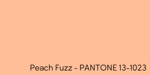
Pantone announced their 2024 Color of the Year – its 25th color of the year – and for 2024, they have selected Peach Fuzz. They describe it as ” a velvety gentle peach whose all-embracing spirit enriches heart, mind, and body.”
The process Pantone goes through for their Color of the Year is very interesting and involves much more than guessing what the trend will be. The Pantone Color Institute studies color trends throughout the year before selecting the new year’s color, exploring color usages in interior design, fashion, films, and art – all areas of design.
For 2023, they chose Viva Magenta, a vibrant color that really pops. While Peach Fuzz feels more subdued and calm, it can be very effective in graphic design when paired with proper contrasting colors.
As they do every year, Pantone has released a set of color palettes for their color of the year. If you want to learn more about Pantone’s 2024 color of the year, head over to their website and explore the palettes and usage examples.
Pixel art: Nostalgia meets innovation
Pixel art is a design style rooted in the early days of digital graphics. In 2024, this nostalgic aesthetic, characterized by its blocky and pixelated look, is embraced for its retro charm and ability to convey simplicity and authenticity. Pixel art is a deliberate departure from the norm in a world inundated with high-resolution images and sleek interfaces. At Omnivex, we use pixel art as a design element across many digital properties, including our website, social media and office digital signage.
Doodles and hand-drawn elements: Embracing the personal touch
In this dawn of AI and its impact on designs, the human touch is returning to digital design with the increasing popularity of doodles and hand-drawn elements. In 2024, designers are expected to infuse their creations with spontaneity and authenticity by incorporating hand-drawn illustrations, sketches, and doodles. It could be as simple as a hand-drawn arrow or as complex as a complete design. This trend reflects a desire to make brands more personal and approachable, fostering a connection with audiences who crave authenticity in a world dominated by polished and perfected visuals.
Old print style ads: Blending the past and the present
This coming year, designers will draw inspiration from the past, this time taking inspiration from old print-style advertisements. This trend pays homage to the classic typography, layout, and graphic design elements that characterized print ads from decades past, notably the 70s and 80s.
Expect to see digital campaigns that mimic the look and feel of vintage magazine ads, using aged textures, retro color schemes, and classic serif fonts to create a sense of nostalgia. This blending of the old with the new adds a touch of sophistication and timelessness to digital designs.
Gradients: Seamless blends of color and depth
Gradients have been a design mainstay for some time, but in 2024, we see them evolving into more complex and nuanced forms. Experiment with gradients to create seamless transitions between colors, adding depth and dimension to digital interfaces. Create animated gradients to use as backgrounds, adding motion and drawing the viewer’s eye to your message.
Additionally, leverage them to guide user focus, create immersive experiences, and evoke specific emotions. Expect to continue to see gradients used in backgrounds, overlays, and even as a focal point of design compositions, pushing the boundaries of what is possible with this versatile design element.
Serif fonts: Timeless elegance in typography
While sans-serif fonts have dominated digital design in recent years, in 2024, we will see a resurgence of serif fonts. Characterized by their decorative strokes and flourishes, serif fonts can bring a sense of timeless elegance and sophistication to digital typography.
%20(1).png)
ADA compliance is critical when considering fonts on your digital signage screens. Since digital signs use visual characters, there’s no requirement to use a sans-serif font like with physical signs. The question becomes what we should use instead of what we must use. Many people find sans-serif fonts easier to read, cleaner, and less distracting. If you want to use a serif font, make sure the characters are conventional in form. Don’t choose an overly decorative font. Avoid overly decorative fonts with unconventional characters for your message. Use them as part of your visual design as a graphic element, but keep your messaging clear with a sans-serif font.
2024 promises a digital design landscape vibrant with possibilities. From bold minimalism to vivid colors, pixel art to hand-drawn elements, old print style ads to gradients, and the enduring allure of serif fonts, designers will have a rich palette of trends to explore and integrate into their creations. Brands can embrace these trends to captivate audiences, evoke emotions, and create memorable experiences.
(January 12, 2024). Jennifer Gvozdek – Digital signage today. Retrieved from https://www.digitalsignagetoday.com/blogs/digital-design-trends-to-dominate-in-2024/